Design can be art. Design can be simple. That’s why it’s so complicated
Paul Rand
While working for the growth team at MOVii, I was approached by the UX Designer to animate some products of the app. This task gave me the opportunity to learn about Lottie, a mobile library for Android and iOS that parses Adobe After Effects animations exported as json with Bodymovin and renders them natively on mobile and on the web.

Spin n’ splash: this animation packs two waiting periods; a short spin and a longer splash transition. It’s made this way convey the user a sense of time with-in the app. (click on the animation to download the free after effects project).
One of the main projects was to improve the outdated onboarding experience for the MOVii Card purchase, the flagship product. The following is the complete experience as seen currently on the app


All animations I’ve done for mobile and web are available for download in my Lottie profile page, free to use and edit.
For the past year I have been honing my skills designing marketing content through a lot of media; motion graphics, video editing, 3D render and animation and photo editing. These are some examples of advertising and organic content done for MOVii.
In todays marketing world, growing an organic community of users is key to be in the top of mind. It’s also a gateway to promote word-of-mouth.
You can find MOVii’s stickers and gif on Twitter, Instagram, WhatsApp and Facebook. Mainly, any social media platform that imports gifs from Giphy.com. These are some of the most used stickers in MOVii’s channel.


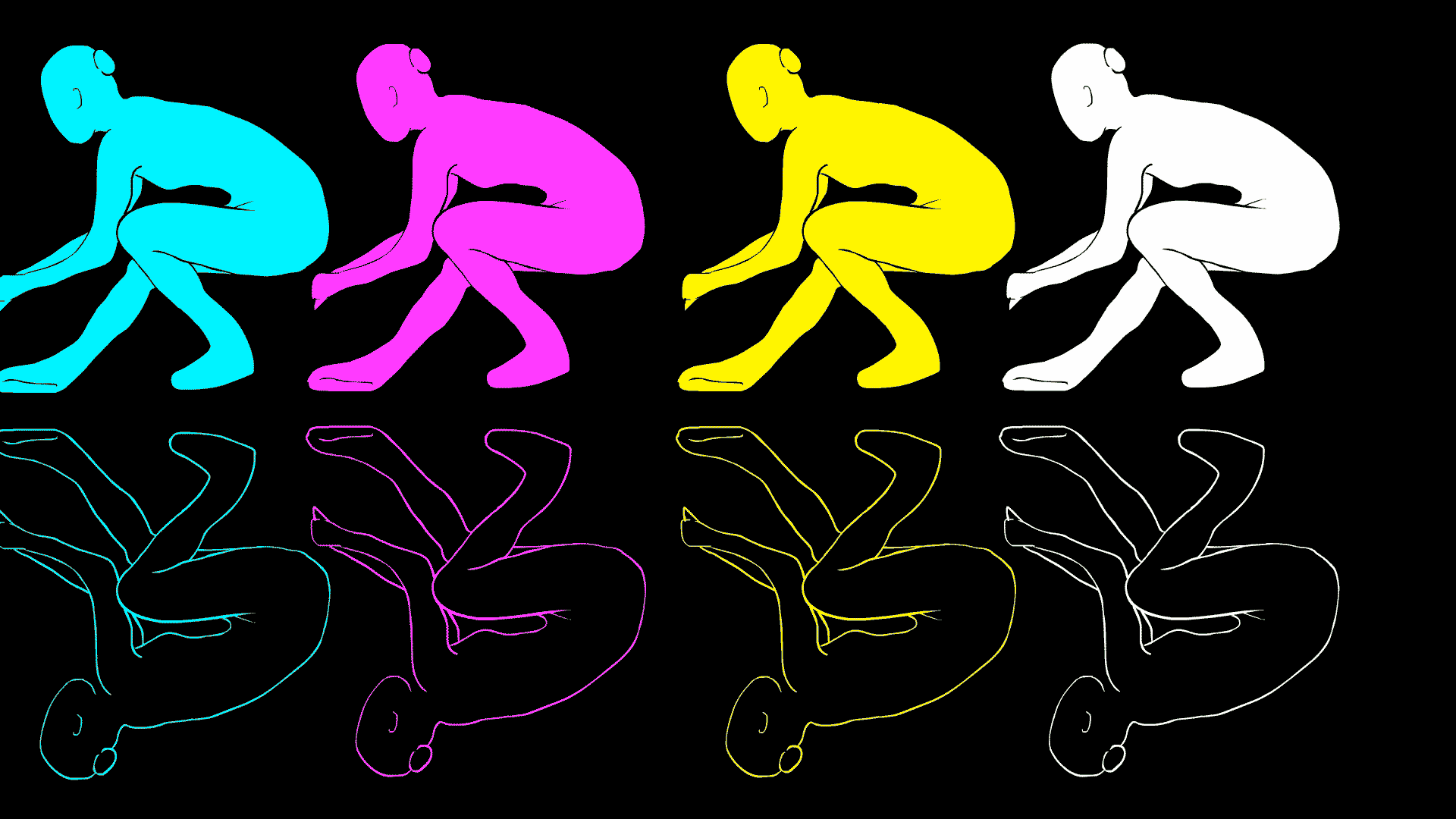
prosthesis exploded-view
Define a product or service subsystems.
Evaluate relationships between subsystems
Typology research
Product prototypes
Product manual / user guide
Intervention points
Redundant subsystems
Design insights

The subsystem analysis is a method that to evaluation taxonomically a product or service. It is especially useful when there is a large number of morphological or functional share components. For example, a hand lantern; The vessel is an element that houses several functions and subsystems, such as containment, handling, protection, among others.
This projects is part of a larger subsystem analysis of a game controller. This post only contains the controller redesign.

This abstract diagram shows, the layout of a generic game controller. After looking at various controller, a general morphological pattern is noticeable; the main focus are the handles [directional subsystem] and the buttons [interactivity subsystem].

Given that the main design objetive was to:
prevent irritation and illness caused by maintaining a prolonged static position by offering two playing-modes; (1) maintaining the original grip, but allowing the variation of button distribution over the control surface and, (2) a new grip, that changes the position transferring the stress to fingers and palms without affecting the usefulness of control
The new layout, keeps some subsystems [electric and joint] and changes some [structural, directional, interactivity]

This GIF shows how the variation of button distribution over the control surface feature works. A player can access the same set of switches with four different variations, hence the players performance is not affected.